The 1-bit interface
June 17, 2013
Much of what I’ve heard when I hear about UX is: How do we arrange everything on the screen so that a user can figure it out and quickly accomplish their goals? How do we make use of graphic design, layout, text, interactivity, affordances, animation and so on to make things easier for the user?
Lately I’ve start learning to build electronics with Arduino and it’s made me much more sympathetic to the designers of simple hardware. You don’t have an entire screen to fill up with design elements, text, and so forth. Sure, the tasks your user will complete are simpler, but when you’re just starting out you’re limited to buttons, LEDs and maybe some sensors.
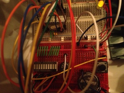
So I had to think a lot about how to design the user interface for my first project, a simple timer. The idea is that you start it up, you hit a button to select the number of minutes you want it to count down, and you’re done. (I don’t actually like using my phone for things like this, which maybe I’ll talk about in a separate post. And there are tons of tasks for which it would be very convenient to have a minute timer nearby, like brushing your teeth or making coffee in a French press).
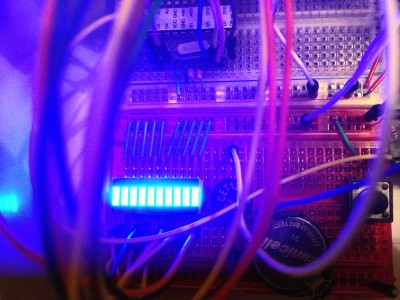
The actual timer countdown part is relatively straightforward. The maximum number of minutes is 10, and each bar represents a minute when it is lit up. As the seconds pass, the the bar representing the current minute blinks more rapidly. Interestingly, my wife and I both had the same reaction to this, which is that the blinking light induces anxiety; a suprisingly emotional response for such a simple machine! When the timer is over, all the lights blinks, and the timer plays one of five randomly-selected tunes, including the X-Files theme, some Mario stuff, and a couple of other familiar ones.
But when you start the timer up, how can we at least try to indicate to you that it’s waiting for input? The way I settled on was two fast flashes of all lights, then waiting, then flashing again in a loop. I guess I also could have gone with a single slow flash, like a cursor terminal, but that seemed as if it would be very monotonous and not inviting. But it’s fairly complex and there isn’t a lot to work with, only ten bits of information, plus you can vary them over time.
It’s an interesting UX exercise. How much can you convey with that? What if you just had a single LED?

